
It amazes me how much I use my smartphone on a daily basis. I even get notifications about my screen time to remind me that maybe I use it a little too much. According to Pew Research, 97% of Americans own a cell phone and nine out of ten own a smartphone (https://www.pewresearch.org/internet/fact-sheet/mobile/). I remember my first mobile phone which was a bag phone located in my car back in 1994. I thought this was the best thing ever. I was a young, single mother of three children under the age of six. I was never home because I worked, picked up my kids from school, brought them to extracurricular activities then home. I felt like it was a necessity to contact others while doing my mom duties.
Fast forward to today; what would I do without the ability to look up a restaurant, respond to work emails or look up a location with maps? It is frustrating when I come across a search on my smartphone that I can’t read very well. That is why I wanted to audit the desktop and mobile version of a website. I chose a place that my husband and I frequent often as it is right down the road from where I live, Fox Harbor Pub and Grill. My audit begins by viewing the first pages of the website from the mobile and desktop versions.

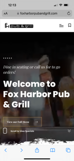
Desktop
Mobile
The desktop and mobile versions are similar in that the backgrounds of both are a moving video. In my opinion, this is very distracting. Both versions allow for you to click on a button that says, “View Full Experience” which puts the distracting video into a box with a video produced by Vimeo. As a user, this button was not clear enough for me and I did not understand what “View Full Experience” meant.
The only differences or changes that happen from the desktop to the mobile version is the menu is spelled out across the top right for the desktop and the menu for the mobile is found by clicking the three lines in the upper right. There is a box next to the menu that is titled, “Gift Cards” which is meant to purchase gift cards. On the mobile site there is a symbol to the right of the three lines that I am not sure where it will send me to when I click it but when I do, low and behold, it is to purchase gift cards. Also along the top of the desktop version is the phone number, address and open hours whereas with the mobile version that information is listed in numerous locations toward the bottom of the page. Another change I noticed was that the content, which is the same for both versions, is stacked vertically on the mobile version. I think that the company they hired to improve their website used a responsive web design method so that the content would fit the smaller screen size.
One change that should happen on the mobile version is to get rid of a scrolling picture. These three photos (below) scroll on the mobile version but do not on the desktop. I would just keep the one picture about happy hour to match the desktop version and get rid of the other two that scroll because they are of poor quality, making the website less credible.


The user experience for this website is confusing and unclear. I think that the website is probably not getting many conversions but may just be making the user aware of what they have to offer. It definitely was not designed for usability or conversion. Most restaurant websites have the ability to order online and this one tells you to call to place an order. There are links that are not clear as to where they lead and there are distractions right from the beginning with the video I mentioned above. They have not created visual hierarchies or placed similar items together. The food menu is found on the top of the website and further in the middle but the beer menu is a link on the bottom of the site. I am guessing that they want you to download an app to view the beers. I don’t know about you but you must have to really like beer to want to download an app just to see their beer list.

I find that websites for restaurants are poorly constructed unless they are a high end establishment where they have a lot of foot traffic and can afford to maintain the best website. Or maybe it is because they have a great website so they have a lot of foot traffic. Either way, my world is food and beverage and I use my phone to search out new dining experiences all the time.
 Eagle Digital
I agree on the food industry and websites. They aren’t as informative as they maybe could be and def need a call to action for success. I’m from a small town and most of our restaurants don’t even have a website, you have to find their 10+ year old menu’s online. Not trustworthy
LikeLike
This article made me think of when I was growing up and how teachers and parents alike would always hound me or my peers regarding the phones impermanence or obstructive nature in this world. It’s funny to see how things remain or advance even through the changes.
LikeLiked by 1 person
I had to “lol” at your “You must really have to like really like beer to download an app.” You’d be surprised by some of the people out there. I’m those people. I can’t remember the last time I actually looked up a restaurant menu on a desktop or laptop (I have a laptop). Whenever I am scrolling for something to eat, I’m usually on my couch too lazy to get up and microwave anything so it’s interesting to see the differences between the desktop version and mobile version. This may just get me to do the same thing from one of my favorite places to eat/order from.
LikeLike
I like your style of writing, it is very entertaining and compelling. Mainly how you describe everything the way it is. No beating around the bush.
LikeLike